The Covid pandemic was one of the strangest periods of our lives.
For a few years, the world seemed to stop in its tracks. Streets went silent, cities emptied, and our daily routines were suddenly reshaped by lockdowns and strict restrictions on movement. It was a time that forced us to rethink society, freedom, and even ourselves.
And, of course, the reason behind it all was grim: illness and death. Millions were affected by the COVID-19 virus, while millions more went through an emergency vaccination campaign that promised a way out of the crisis.
In the middle of this, I was in my final year of university. The pandemic hit Italy in the early months of 2020, bringing with it the first nationwide lockdown. After a brief window of relief during spring and summer, new restrictions followed in the months ahead. Life felt like a cycle of reopening and shutting down, always with a lingering uncertainty about what would come next.
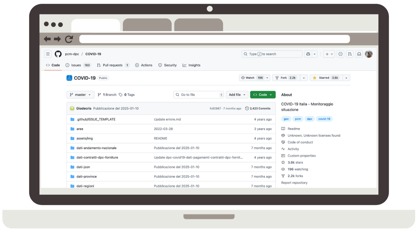
But after the first shock, something unique happened in Italy—something that, as far as I know, very few countries attempted. COVID-related data—numbers of infections, hospitalizations, deaths, and later vaccinations—were made publicly available as open data. Updated daily, they were shared on a dedicated GitHub repository. To me, this was remarkable: a real act of transparency and, in a way, efficiency from our Protezione Civile. It’s not common for governments to publish this kind of information in such a structured and accessible way.
It was in the autumn of 2020 that I stumbled upon this repository. By then, the air was thick with news—some accurate, some misleading, some pure speculation. That’s when a thought struck me: what if I try to make sense of the data myself, instead of drowning in unverified headlines and rumors?
The CovidAnalysis Project
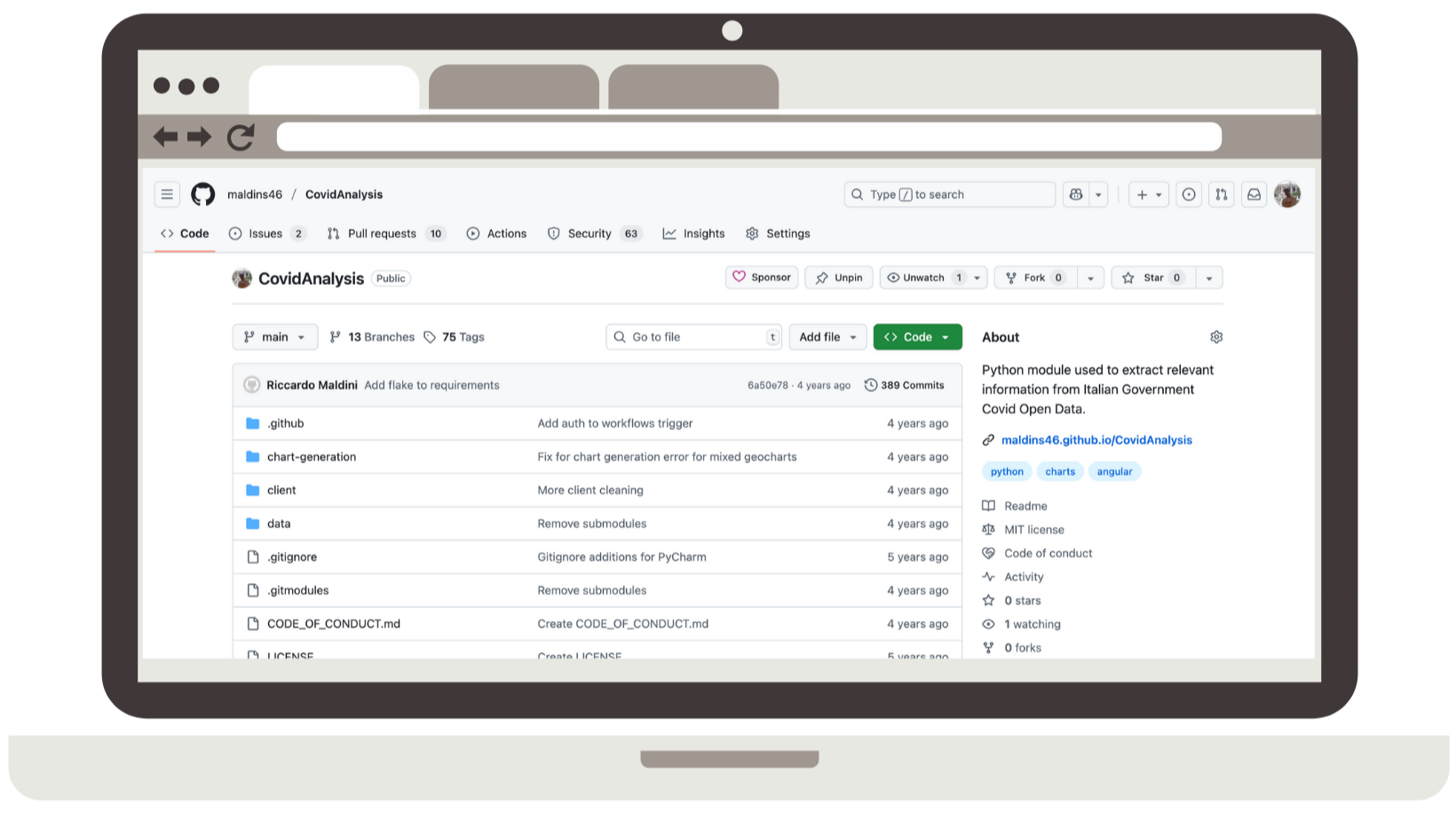
In November 2020, I started the CovidAnalysis Project, a not-so-original name for a small GitHub repository where I experimented with visualizing the data published by the Protezione Civile.
The repository looked very different in its early days compared to what you can see now. At first, I simply created basic plots using Matplotlib’s PyPlot library. Nothing fancy—just simple charts to get a clearer view of the numbers.
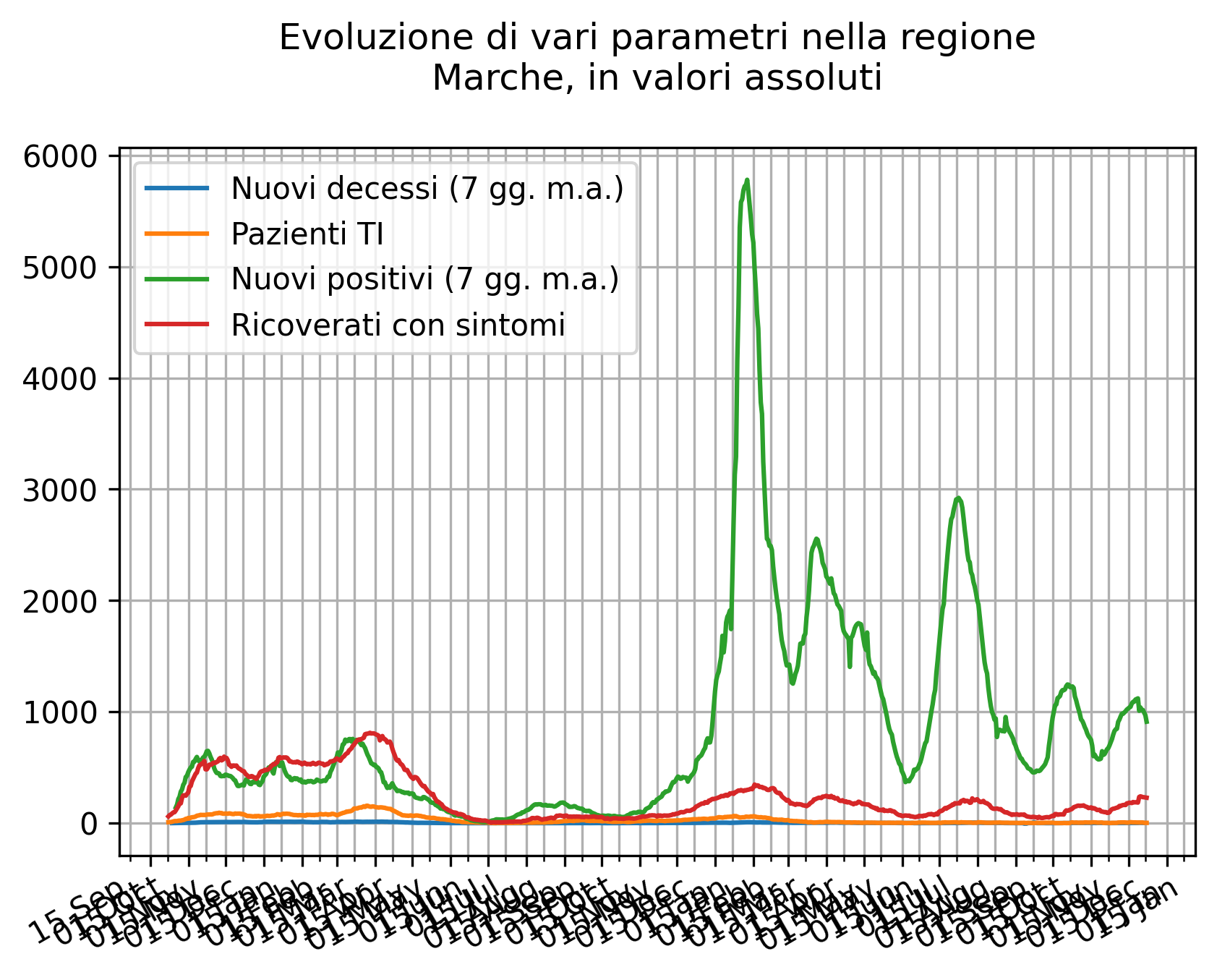
I began with the basics: the number of deaths and infections, both as weekly incidence and absolute values. I was particularly interested in the data from my own region, Le Marche, since local information wasn’t always easy to find in national news.
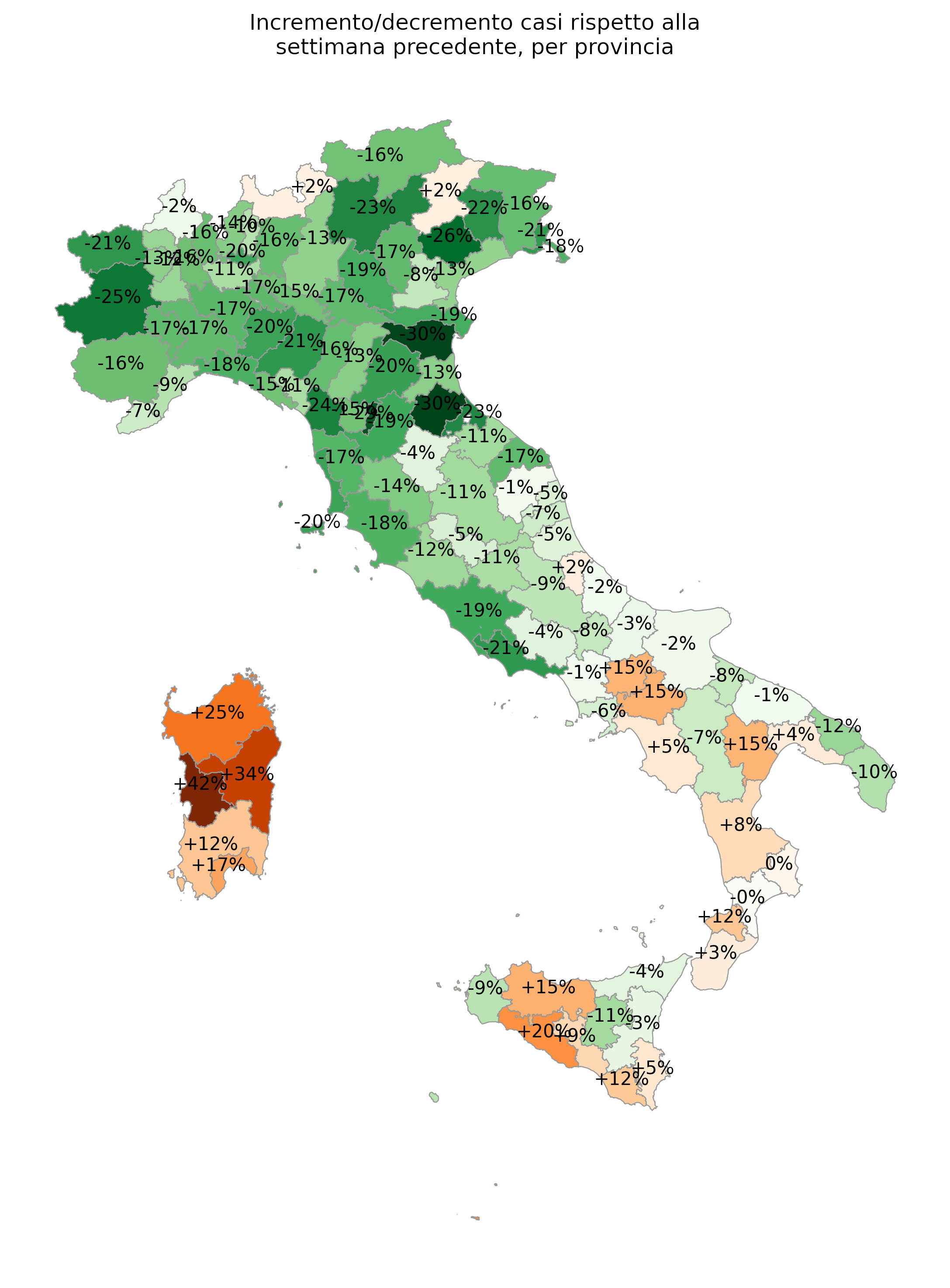
As I got more comfortable, I started experimenting with more advanced analysis. I built geographical maps showing data per region and province, calculated derivatives to track daily increases or decreases, and even tried to estimate the infamous RT and R0 indexes per region—later adding vaccination data as well.
What made this project truly fascinating was its immediacy. The data wasn’t historical or archived: it was unfolding in real time. Every day I could update my charts and see the impact of new cases, comparing how infections rose or fell against the thresholds the government used to determine lockdown measures.
CovidAnalysis quickly became more than just a coding exercise. For me, it was a powerful way to make sense of the chaotic reality around me, and to replace anxiety with understanding.
Let’s Go Public!
By December 2020, I started realizing that all the information I was generating was pure gold. It felt like a waste to keep it only for myself. Wouldn’t it be great to share these insights with others?
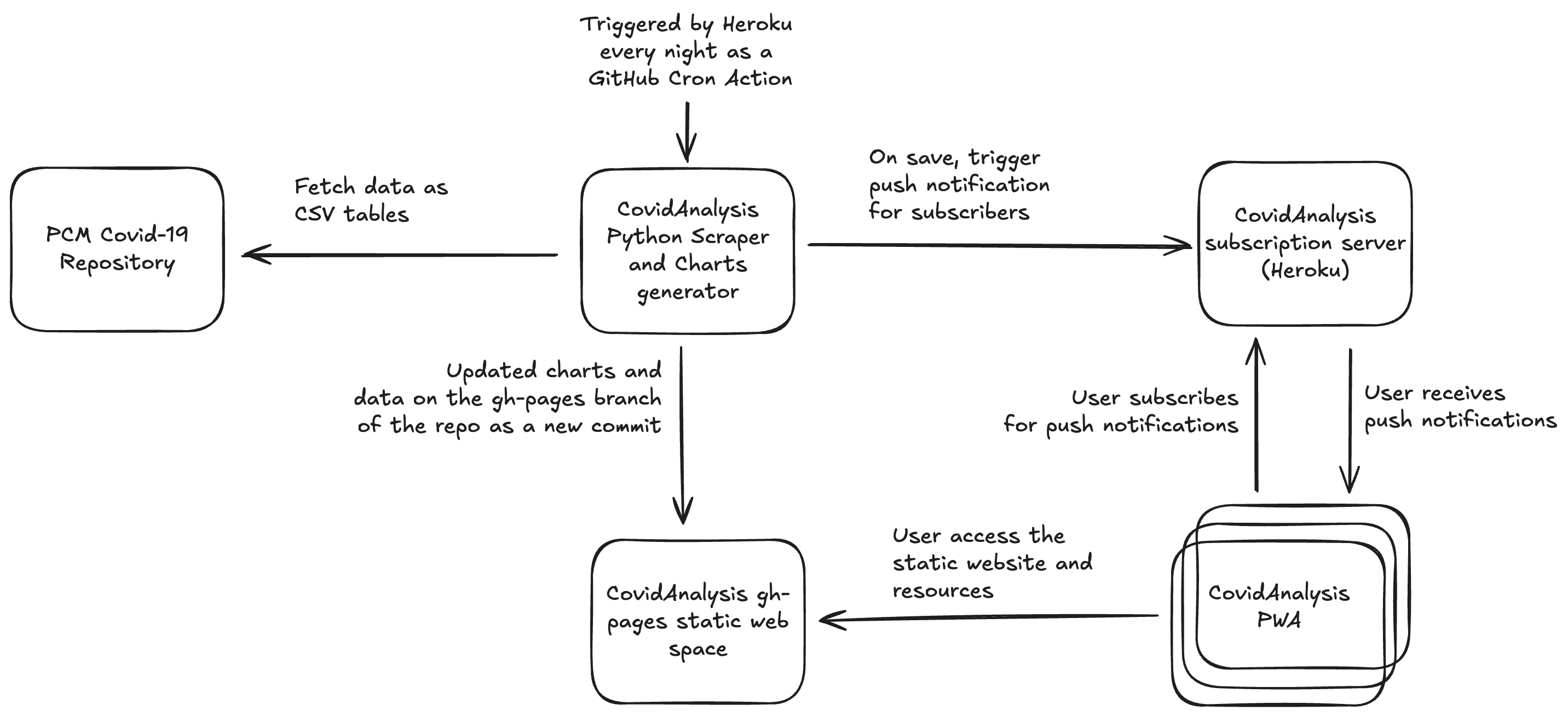
The first step was automation. I set up a GitHub Action with a cron job. Every morning at 4 a.m., the Action would spin up a container, run the Python scripts, generate fresh plots, and export them as JPEGs. The images were then committed back into the repository on the deploy branch.
The second step was exposing the data. I decided to build a small Angular Progressive Web App (PWA) to display all the charts my scripts generated daily.
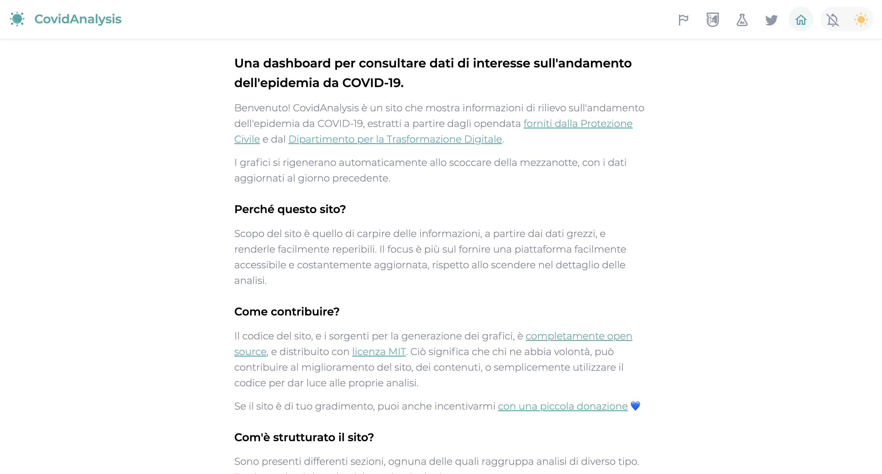
In less than a week, I had the first version up and running. To keep things simple (and free), I hosted it directly on GitHub Pages. Zero cost, minimal friction, and suddenly my data wasn’t just mine anymore—it was available to anyone.
Tweaks and Optimizations
Over time, the website became more than just a data portal—it turned into a playground for experimenting with style and features. I started treating it as a design exercise, trying out Angular’s Material UI and fine-tuning the details of the interface.
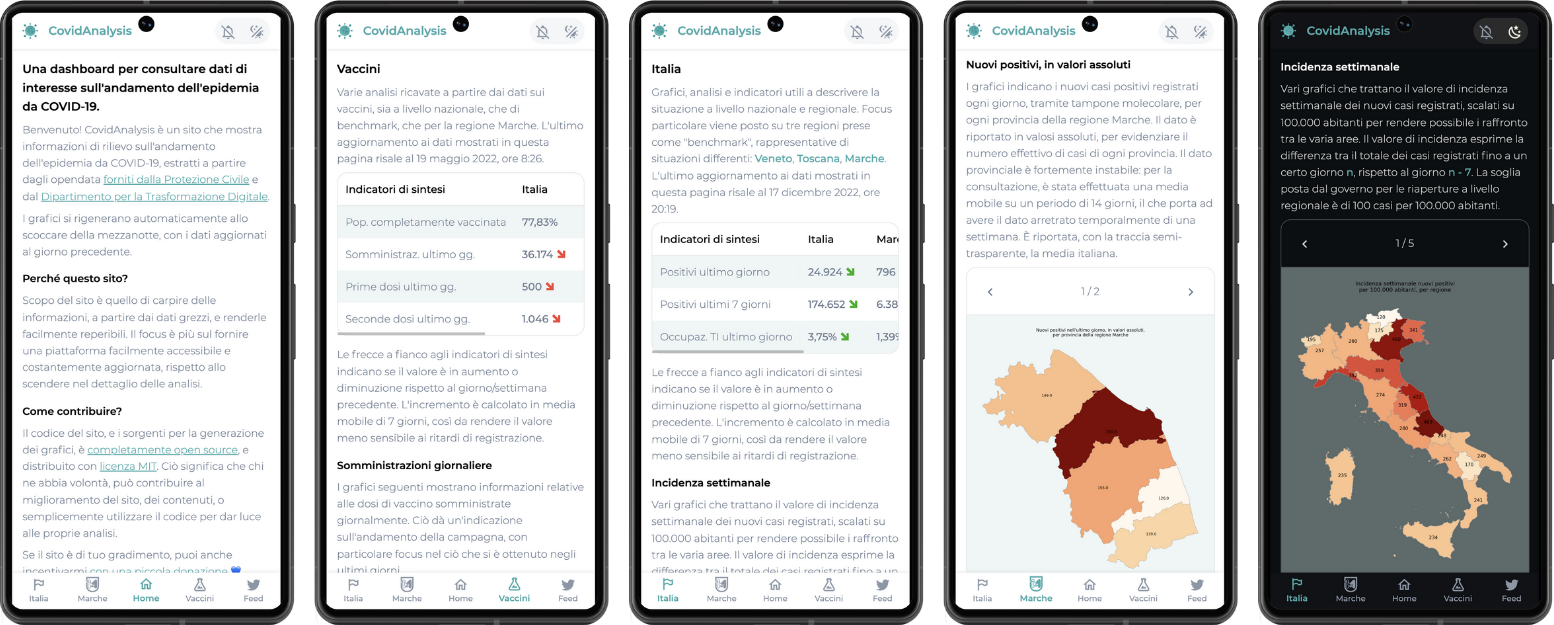
I also restructured the site into multiple sections: one dedicated to national Italian data, another focused on my home region of Le Marche, and a third where I pulled in pandemic-related news directly from Twitter.
On the design side, I couldn’t resist adding a dark mode, along with an automatic theme switch based on the user’s system preferences.
But the feature I’m most proud of was the notification system. I experimented with push notifications: whenever new daily data was processed, users would receive a notification. To achieve this, I combined service workers with a minimal backend deployed on Heroku.
Conclusion
What started as a small experiment in my final year of university quickly grew into something much bigger. CovidAnalysis was never meant to be a polished product. It was a playground where I combined curiosity, coding, and a very real need to make sense of the world around me.
Along the way, I learned how to fetch and process open data, automate workflows with GitHub Actions, build and deploy a frontend with Angular, and even push the boundaries of PWAs with notifications. But more than the technical lessons, this project gave me something deeper: a way to cut through the noise of misinformation and uncertainty during one of the most confusing times of our lives.
Looking back, I see CovidAnalysis as more than just a coding project. It was my way of understanding reality through data, of feeling a little more in control when everything around us felt unpredictable.